
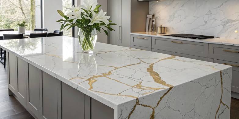
Choosing a countertop color can influence the entire appearance of a kitchen or bathroom. From cabinetry and flooring to lighting and decorative accents, every design element contributes to how the finished space looks and feels. Careful quartz countertop color selection helps create a cohesive interior while balancing personal style, practical needs, and long-term appeal.
Quartz countertops are available in a wide range of colors, patterns, and finishes. Some designs feature crisp white backgrounds and subtle veining, while others introduce warm beige tones, deep charcoal shades, or dramatic marble-inspired patterns. Understanding how these options interact with surrounding materials makes it easier to select a surface that complements the space rather than competes with it.
Why Quartz Countertop Color Selection Matters
A countertop occupies a significant visual area in many kitchens and bathrooms. Its color can influence the perceived brightness, spaciousness, and overall atmosphere of the room. A carefully selected shade also connects different materials, creating a consistent design throughout the interior.
For example, a white quartz countertop can create a fresh appearance alongside light cabinetry, while a darker surface can introduce contrast against pale cabinets. Warm neutral tones may complement natural wood finishes, helping create a welcoming environment.
Beyond appearance, the countertop should support the intended use of the space. Kitchen surfaces must work alongside backsplashes, appliances, and cabinetry, while bathroom countertops should coordinate with vanities, wall colors, mirrors, and fixtures.
The goal is to select a color that looks appealing within the complete design rather than choosing a slab based on its appearance in isolation.
Quartz Countertop Color Selection Based on Interior Style
Different interior styles often benefit from particular color combinations. Identifying the desired atmosphere before comparing countertop samples can narrow the available choices.
1. White Quartz for Bright, Timeless Interiors
White quartz countertops remain a versatile option for contemporary, traditional, and transitional interiors. Depending on the design, a white surface may feature subtle gray veining, delicate movement, or a clean, consistent appearance.
White countertops work particularly well with white, cream, light gray, and natural wood cabinetry. They can also create a striking contrast against navy blue or dark green cabinets.
However, not every white surface has the same undertone. Some appear cool and crisp, while others lean toward cream or ivory. Comparing these variations with existing finishes helps prevent unwanted clashes.
2. Gray Quartz for Modern Spaces
Gray quartz offers flexibility for interiors that favor understated colors and clean lines. Light gray can provide a softer alternative to white, while medium and charcoal shades introduce depth.
Cool gray surfaces often complement stainless steel appliances, white cabinetry, and contemporary fixtures. Warmer gray tones may work better with oak flooring, beige walls, and natural textures.
Pattern also matters. A lightly patterned gray countertop can maintain a restrained appearance, whereas pronounced veining adds visual interest without requiring a more colorful palette.
3. Beige and Cream Quartz for Warm Interiors
Beige, cream, and other warm neutral shades can create a comfortable, inviting atmosphere. These colors pair naturally with wood cabinetry, brass hardware, earthy tiles, and warm lighting.
They are especially useful when a design feels too stark with pure white or cool gray surfaces. A warm countertop can soften the contrast between cabinets and flooring while maintaining a refined appearance.
Before making a selection, compare the countertop’s undertones with the surrounding materials. A beige surface with yellow undertones, for instance, may look noticeably different beside a cool gray floor.
4. Dark Quartz for Contrast and Definition
Black, charcoal, and deep brown quartz countertops can establish a strong focal point. Against light cabinetry, a dark surface creates contrast and gives the kitchen or bathroom a more defined appearance.
Dark countertops can also complement darker cabinetry when the design incorporates differences in texture, lighting, or surface pattern. Without these variations, similar shades throughout the room may create a visually flat result.
Lighting deserves particular attention when considering darker colors. Evaluate how the surface looks under both natural and artificial light to determine whether it supports the intended atmosphere.
Five Practical Steps for Choosing a Quartz Countertop Color
A structured selection process can make countertop shopping more manageable and reduce the likelihood of choosing a color that conflicts with other design elements.
Step 1: Establish the Existing Color Palette
Begin by identifying the dominant colors in the room. Cabinetry, flooring, wall paint, and backsplashes usually provide the strongest visual references.
Determine whether the interior features predominantly warm, cool, or neutral tones. The countertop does not need to match every surface exactly, but its undertones should generally work with the surrounding palette.
If the room already contains several prominent patterns or colors, a simpler quartz design may help maintain balance. A restrained interior, on the other hand, can accommodate a countertop with more noticeable veining.
Step 2: Consider Natural and Artificial Lighting
Lighting affects how countertop colors appear throughout the day. A shade that looks bright in a showroom may appear cooler, warmer, or darker under different conditions.
North-facing rooms, shaded kitchens, and spaces with limited windows may benefit from carefully selected lighter surfaces. Rooms with abundant natural light offer more flexibility, although direct sunlight can also alter the perceived appearance of some colors.
Check samples under the lighting conditions expected in the finished space. Compare them during different times of day whenever possible.
Step 3: Coordinate Cabinetry and Flooring
Cabinets and floors create the foundation of the room’s color scheme. The countertop should connect these elements without making the entire interior appear overly uniform.
Consider three common approaches:
- Coordinated tones: Select a countertop that shares similar undertones with the cabinets and flooring for a harmonious appearance.
- Contrasting colors: Pair light cabinets with a darker countertop, or combine darker cabinetry with a lighter surface.
- Balanced neutrals: Use a neutral countertop to connect cabinetry and flooring that have different colors or textures.
Each approach can work well when the overall palette remains intentional. The right choice depends on the room’s proportions, lighting, and desired style.
Step 4: Evaluate Veining and Pattern Movement
Color is only one part of the decision. Quartz countertops can feature fine speckles, soft tonal variations, subtle veins, or bold marble-inspired patterns.
A surface with dramatic veining can become the centerpiece of a kitchen island or bathroom vanity. In these settings, simpler backsplashes and restrained cabinetry may allow the countertop to stand out.
For smaller kitchens or visually busy interiors, a more subtle pattern may create a calmer appearance. Also consider how the pattern will look across the complete countertop, including seams, corners, and larger uninterrupted areas.
Step 5: Review Samples Before Finalizing
Digital images and small color swatches are useful for initial comparisons, but they may not show every detail of a full slab. Texture, pattern distribution, and color variation can influence the final result.
Whenever possible, view a larger sample or full slab through a showroom or countertop dealer. Place the sample beside cabinet doors, flooring samples, backsplash materials, and paint selections.
This comparison provides a clearer picture of how the finished materials may work together and helps identify differences that are difficult to notice on a screen.
Common Quartz Countertop Color Selection Mistakes to Avoid
Even attractive countertop colors can disappoint when they are chosen without considering the complete room. Avoiding a few common mistakes can improve the decision-making process.
Choosing a color from a photograph alone: Screen settings, photography, and lighting can affect how a surface appears. Physical samples provide a more useful reference.
Ignoring undertones: Two white or gray surfaces may look similar at first but clash when placed together. Compare the subtle warm or cool qualities of each material.
Following trends without considering longevity: Current design trends can provide inspiration, but a countertop is a prominent investment. Select a color that suits the interior and remains appealing beyond a particular trend cycle.
Overlooking maintenance expectations: Color and pattern may influence how noticeable everyday marks, crumbs, and water spots appear. However, appearance alone does not determine stain resistance or cleaning requirements. Review the specific product’s care instructions and performance information before purchasing.
Forgetting the complete layout: A countertop may look different across a large island than it does on a small sample. Consider the surface area, edge profile, seams, and relationship between adjoining spaces.
Exploring Quartz Colors and Surface Options
A broad selection of quartz colors makes it possible to create interiors ranging from understated and traditional to bold and contemporary. Exploring different palettes can also reveal options that were not initially considered.
Hyundai L&C USA offers HanStone Quartz surfaces in a variety of colors and patterns, alongside Hanex Solid Surfaces for projects requiring a different surfacing material. Its online color resources and project galleries provide a starting point for comparing available designs and gathering inspiration.
When reviewing options, compare the appearance of each surface with the practical requirements of the project. Ask a local dealer about available samples, product specifications, fabrication considerations, and installation requirements. These details help connect the design decision with the realities of the finished space.
It is also important to distinguish quartz surfaces from acrylic solid surfaces when comparing products. Although both can serve as countertop materials, their composition, fabrication methods, and care requirements differ. Reviewing product-specific information helps ensure that the selected material suits the intended application.
Conclusion
Successful quartz countertop color selection involves more than choosing a favorite shade. It requires attention to lighting, cabinetry, flooring, undertones, pattern movement, and the overall character of the room.
Start with the existing color palette, compare samples under realistic lighting, and consider how the countertop will look across the entire installation. Hyundai L&C USA offers a range of surfacing options to help homeowners explore designs that suit their interior preferences. Balance visual appeal with maintenance expectations and product specifications before making a final decision.
With thoughtful planning and a careful comparison of available designs, homeowners can choose a quartz countertop that complements the surrounding materials and supports a cohesive, functional interior for years to come.